Use Finnhub API data with Plotly Library for Python
### Technical Summary of Jupyter Notebook for Stock Data Analysis
#### 1. **Setting Up the Environment**
- **Imports**: The notebook begins by importing necessary libraries:
- `plotly` for interactive plotting.
- `pandas` for data manipulation.
- `jproperties` for configuration management.
- `finnhub` to access Finnhub's API.
- `datetime` for handling date and time data.
#### 2. **Configuration Loading**
- A configuration file is loaded which contains essential parameters like the API key, the stock ticker (TICKER), and the plotting template.
#### 3. **Data Retrieval**
- Using the Finnhub API, the notebook fetches stock recommendation trends data for the specified ticker. The data includes analyst recommendations (buy, hold, sell, etc.) over a period and is loaded into a Pandas DataFrame.
#### 4. **Data Processing**
- **Date Formatting**: The 'period' column, which contains the date of the recommendations, is reformatted from 'YYYY-MM-DD' to 'MMM YY'.
- **Sorting**: The DataFrame is sorted by the 'period' to ensure the data is in chronological order for plotting.
#### 5. **Visualization of Analyst Trends**
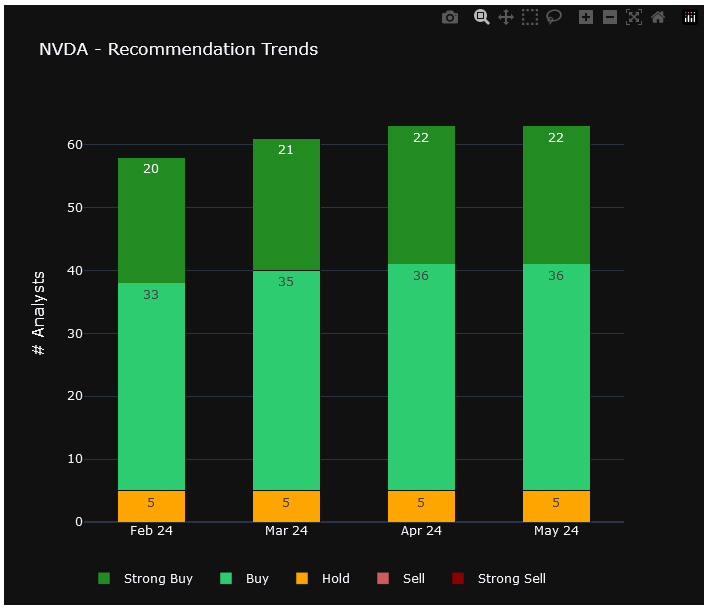
- **Stacked Bar Chart**: The data is visualized using a stacked bar chart, where each category of recommendation (Strong Sell, Sell, Hold, Buy, Strong Buy) is represented by bars of different colors.
- **Layout and Style**: The plot uses a predefined template for consistent styling and includes configurations like font sizes, bar orientation, and stack mode to enhance readability.
#### 6. **Rating Computation**
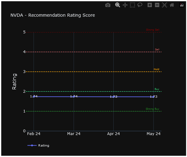
- A new column 'rating' is computed in the DataFrame, which is a weighted average of the recommendations. Each category of recommendation is assigned a numerical weight, and the overall rating is calculated as a weighted average, providing a quick numeric reference to the stock's analyst consensus.
#### 7. **Plotting Rating Scores**
- **Line Chart with Markers**: The computed ratings are plotted against the dates using a line chart with markers and annotations. Horizontal lines are added to represent different ratings visually, improving the interpretability of the plot.
- **Customization**: The y-axis is set with a fixed range to maintain consistent scaling across different plots. Additional customizations include annotations for clarity and a horizontal legend for better layout management.
This notebook provides a streamlined process for retrieving and visualizing stock analyst recommendations using Finnhub's API, with a focus on clean, informative visualizations and effective data handling.


